We’re self-confessed website fanatics – it’s our job after-all.
We love making beautiful websites. But we also appreciate and admire others who share our passion. So to celebrate everything that is awesome web-design, we’ve selected 10 stunning websites that just need to be seen!
From their content, to their userbility, and of-course how good they look; these websites are our pick of the best. So go ahead, take a look for yourself:
The Noun Collective
The noun collective is a documentary series created to inspire, motivate and educate. The site features some eye-watering photography and stunning video footage – causing a real desire to travel to the furthest corners of the World. The visual elements are displayed with simplicity and clarity, showing off their true quality. Ultimately the site, as a whole, feels clean, is extremely easy to navigate and is visually sublime!

Björn Terring
You can’t have a great website without great content – fortunately, great content is something that Björn Terring has in abundance. Photographer, Bjorn, displays his beautiful photography in a wonderfully random grid with truly immersive transitions between pages. We know it isn’t easy to make a gallery appear interesting, however Bjorn’s website has style and experience that matches the quality demonstrated in his photography.

Olson Kundig
We love the clean and understated typography, colour pallette and layout of, Seattle based design firm, Olson Kundig. Like Bjorn Terring, Olson Kundig display their beautiful visual elements in a clear and simple manner, though with a little more formality and elegance. The end result is a website that is crisp, professional and visually outstanding.

Chpt.3
Chpt.3 have created a very dramatic, yet superbly elegant website to show off their luxury cycle wear. We admire their inventive use of parallax and smooth hover animations however, ultimately, it’s the incredible imagery that really makes this site stand out. The site just oozes passion and sheer class.

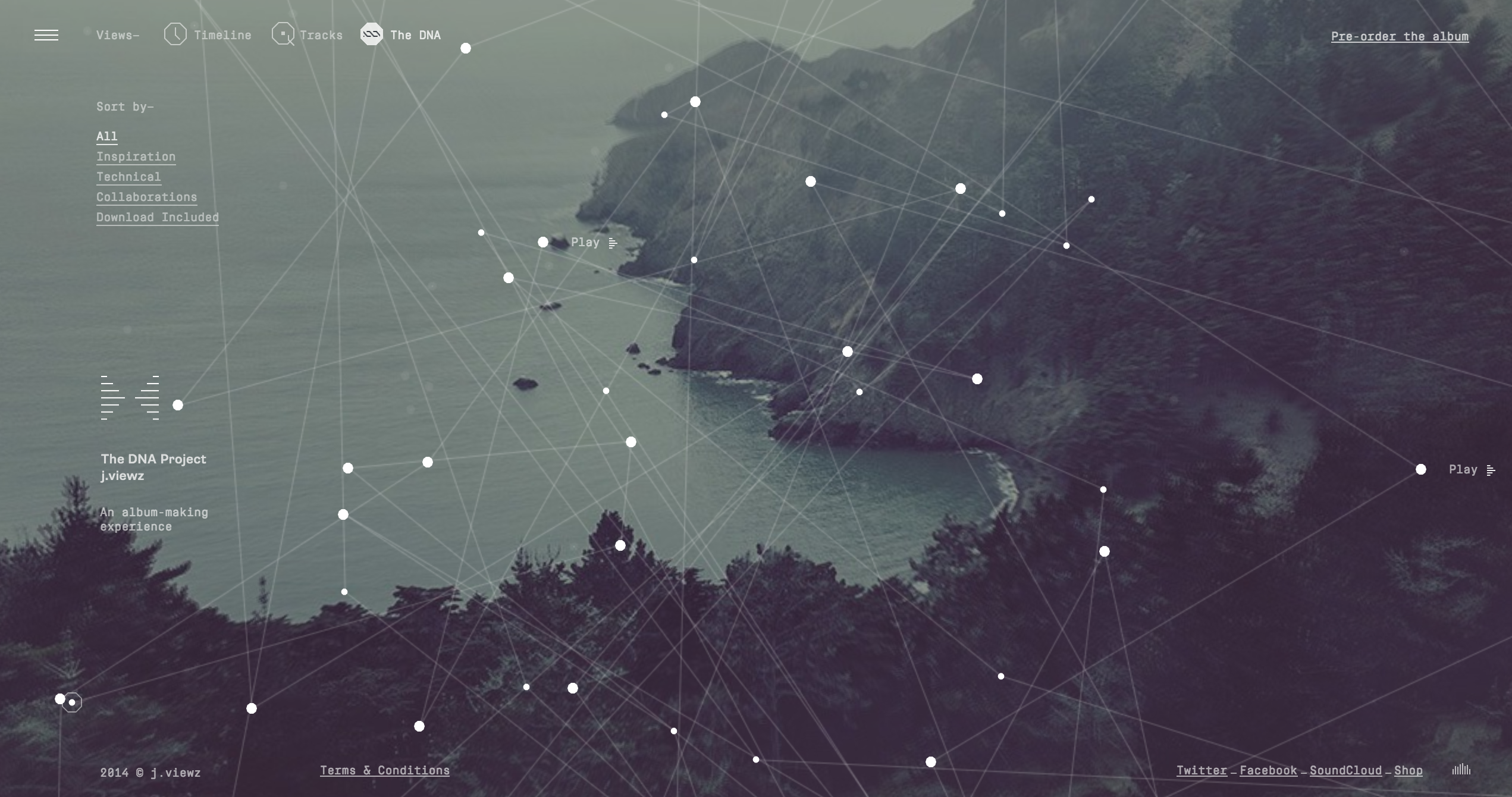
The DNA Project
We love the whole idea behind The DNA Project – follow the process of writing and recording an album from start to finish – which in itself makes this a truly wonderful site. Not to mention that the site is a visual masterpiece, built by one of the best agencies in the world – Hello Monday. The design features incredibly complicated and intricate data visualisation that bridges the gap between music and technology. If music is your thing, check this one out.

In Pieces
In Pieces tackles the issues of species extinction in a thought provoking and ingeniously creative way. Stunning geometric shards built from html elements, combined with some pretty extravagant colours make this a visually and technically clever site with an important cause.

W&Co
W&Co are a design and development company with an absolute cracker of a website. We’ve seen the importance of displaying content in an appropriate manner, and W&Co have done just that. Their site is big and bold, confidently showing off their work with big images and bright colours (as you can see below). Beneath all this is a site with a strong layout and a very easy navigation system. Creative and efficient, the perfect combination.

Studio South
Studio South are a design consultancy based in Auckland, New Zealand. As a company who’s foundations lie in the design industry, it’s crucial that you showcase your work in a visually superior way… Well, Studio South certainly don’t disappoint. The website is minimal and clean yet their obvious talent as designers is portrayed in their amazing case studies, proudly displayed in an interactive gallery. Everything from the typography, to the navigation, even the way the images load feels slick and classy, whilst remaining creative and colourful.

Thibault Pailloux
Art Director, Thibault Pailloux’s, website is simple and elegant, with easy navigation and a minimalistic style. Despite this, it remains creative and striking through a use of modern and stylish typography and bright colour palette.

I Want To Work With You
I Want To Work With You is the website of Creative Developer and Designer, Victoria Nine. Victoria’s site is an extremely imaginative, creative and interactive way to engage an audience. We love the unique scrolling animations, that appear high-tech and show off her ability, yet remain simple and minimalistic aesthetically. The sound effects are awesome too and within the fancy stuff, her content is personal and very well written. P.S try replacing the ‘You’ in the URL with your name….
