South London Theatre

Founded in 1967, South London Theatre (SLT) is an outward-facing community organisation, producing a diverse creative output, from Shakespeare and historical plays to modern comedies and new writing via its adult and youth memberships, as well as being a community hub hosting social events, creating interest groups and learning and development opportunities.
Background
The Covid-19 pandemic sent shockwaves through the lives of many, but those who work in theatre, close to the epicentre, felt the full force when the prime minister advised the public against visiting theatres; the sector was suddenly in the danger zone.
We saw working with SLT as an opportunity to make a difference.
The Brief
The team at the SLT required a slick and professional new website which mirrors the high quality of productions the theatre is renowned for and provides users with a seamless and enjoyable website experience through a revised content architecture.
The new website had to act as a digital platform for brand expansion to support its audience development strategy, create a broader appeal and be more accessible to encourage all people in society who love and enjoy the theatre, to get involved.
User experience
One of the biggest challenges we faced was stripping back all of the excess content and unnecessary pages from the old website and finding a way to weave together all of the essential content on the new website.
We worked closely with SLT team to understand the requirements of the site and to gain an understanding of their audience, their priorities and their needs. This helped to develop a streamlined and effective sitemap, primary user flow and an information architecture map. All of this, combined with wireframes for the entire site, enabled us to progress into the design phase with a comprehensive understanding of both the client’s and their audience’s needs.
Making it box office
One of the main goals for the site was ensuring that SLT’s performances were showcased in an inspiring and engaging way, clearly providing key performance info and allowing users to buy tickets easily. This presented us with a challenge because we needed to combine performances with a whole host of other events that take part within the building, from Zumba classes to child-acting schools.
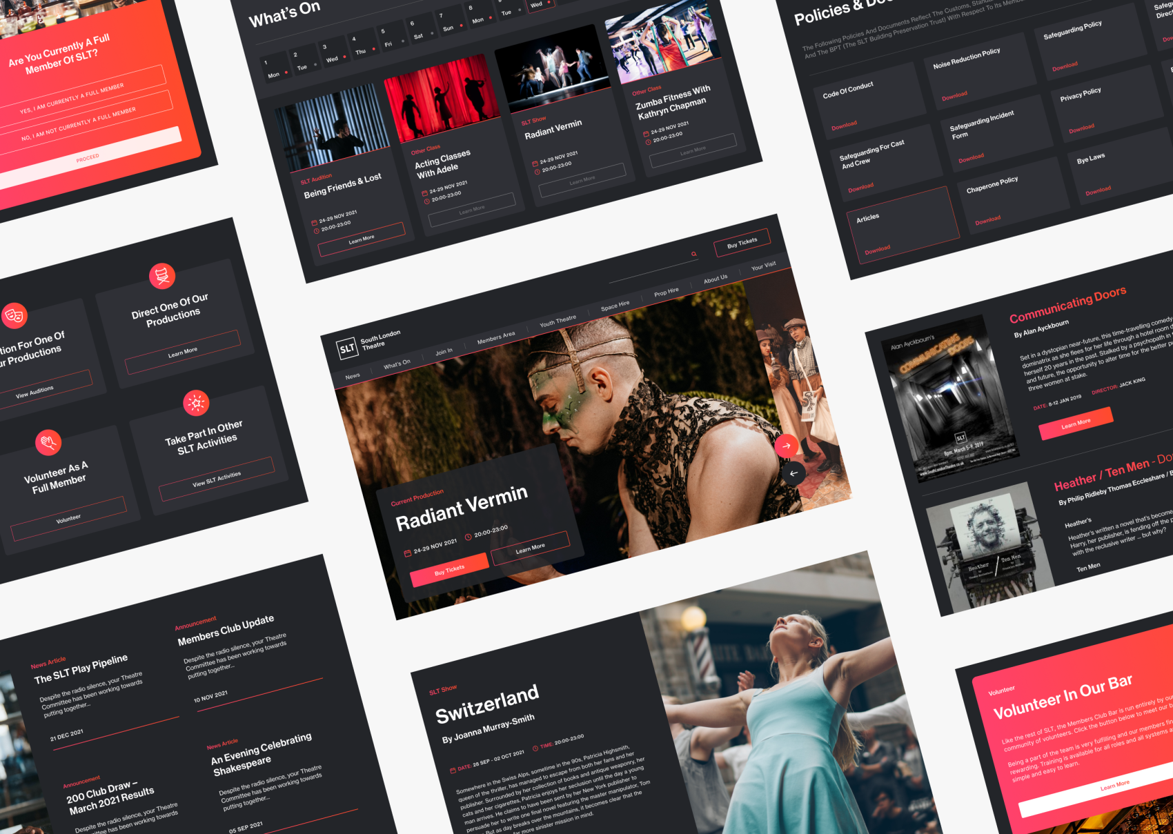
To solve this, we developed a ‘dual-view’ events feed. This allows users to quickly navigate highlight events and performances via a visual feed or ‘switch to a calendar’ view which allows all events to be displayed chronologically in an interactive calendar.
Web design
With the knowledge gained from the UX phase, we knew the site was extremely copy-heavy and, aside from performance posters, there wasn’t an abundance of imagery to help balance the written content.
We made clever use of interactive elements such as accordions, sliders and modular components to help segment large sections of text and allow focus on key areas. We also designed a large suite of iconography to visually support certain sections of the site.
A modular approach
Finding a way to effectively display all of the existing copy and allow SLT a large amount of flexibility to add and change the copy in the future, proved to be quite a challenge across a large site. We solved this by creating dynamic modules that could be reused and repurposed.
Modules allowed the text to be formatted in a variety of ways and, when mixed with different colour options, no two pages felt the same. The adaptability of this intuitive concept allowed us to create a bespoke and easily digestible site that is future-proof, by allowing for ongoing adaptions to content.
Defining the digital brand
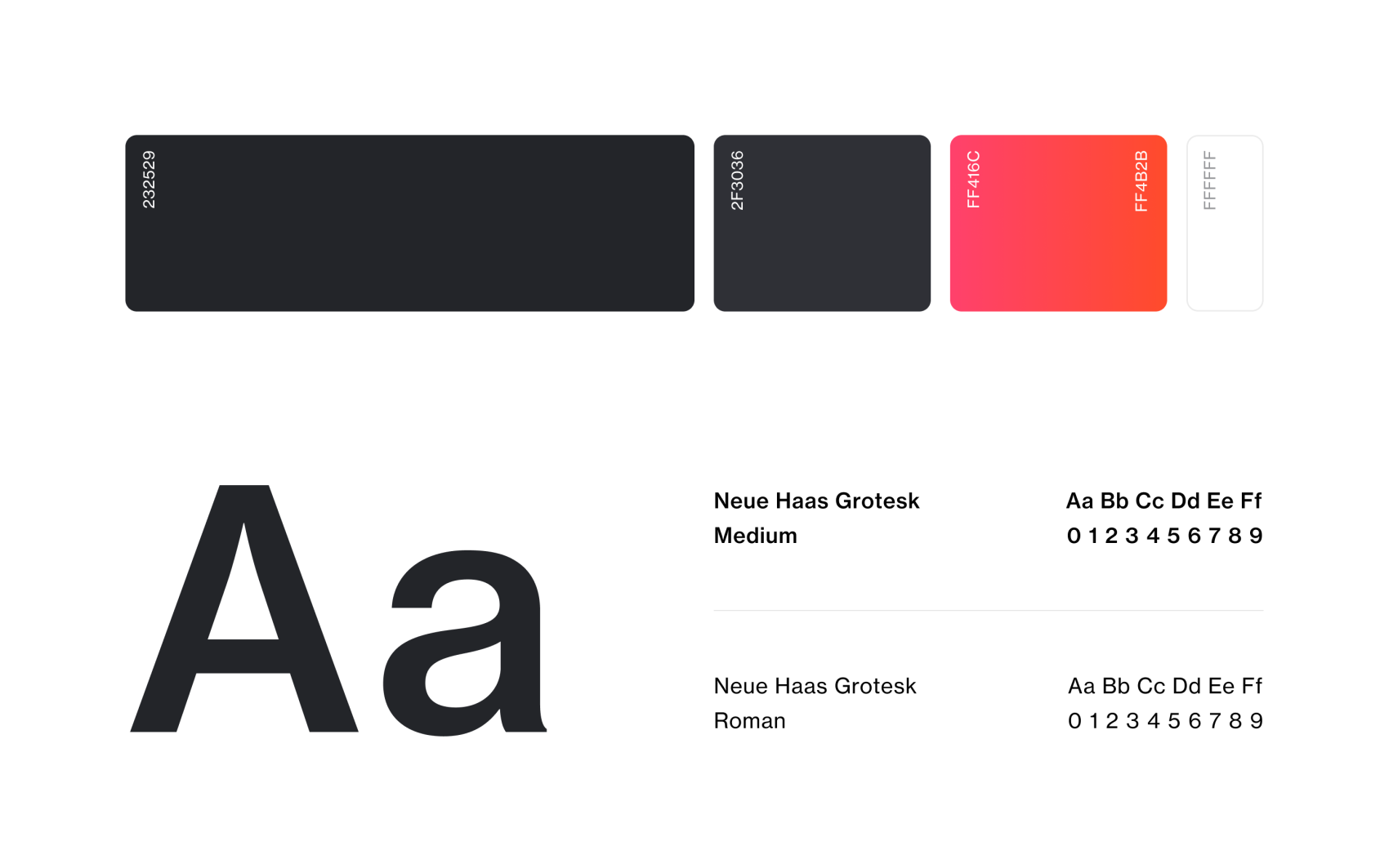
Though SLT already had an established brand, we saw the potential in expanding and diversifying the existing styling for a digital environment. We infused the standard black and greys of the existing brand with slight hints of blue to create a deeper, more sophisticated colour pairing for the background of the site.
In order to avoid creating an overly moody site, we paired the darker colours with an exciting and vibrant pink to red gradient to feature as the primary accent and crosshead colour. We also refreshed the typography with a modern and highly legible sans serif.
Responsive design
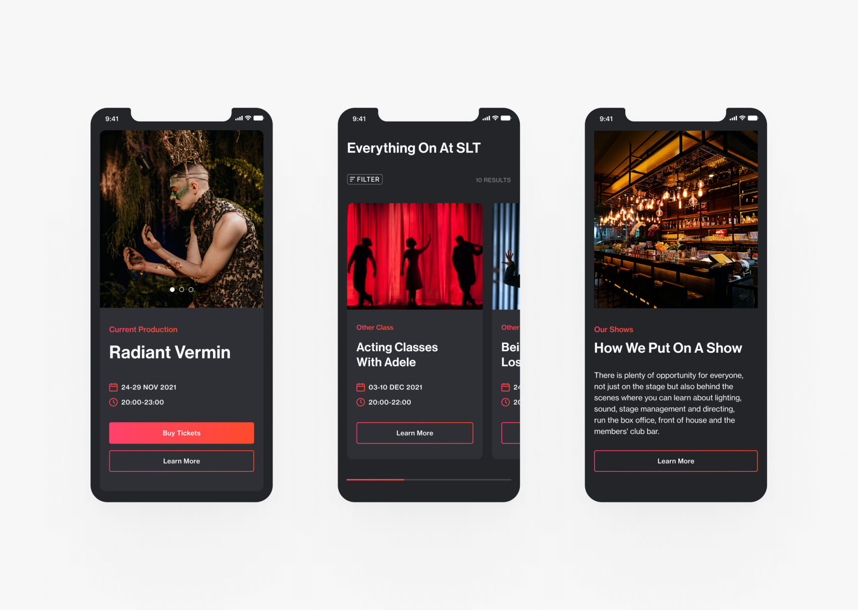
Did we mention we like a good challenge? Well designing the site for mobile and tablet didn’t disappoint. Typically we design components for different screen sizes simultaneously however this project required certain elements of the design to be created totally separately for a variety of screen sizes. For example, the events feed proved difficult to find a way to display portrait imagery that was large enough to read but not so big the images stack and disappear off-screen.
Across the site, we made clever use of sliders, collapsable elements and filters to help users access the content they want to see without the need for excessive scrolling.
From digital to print
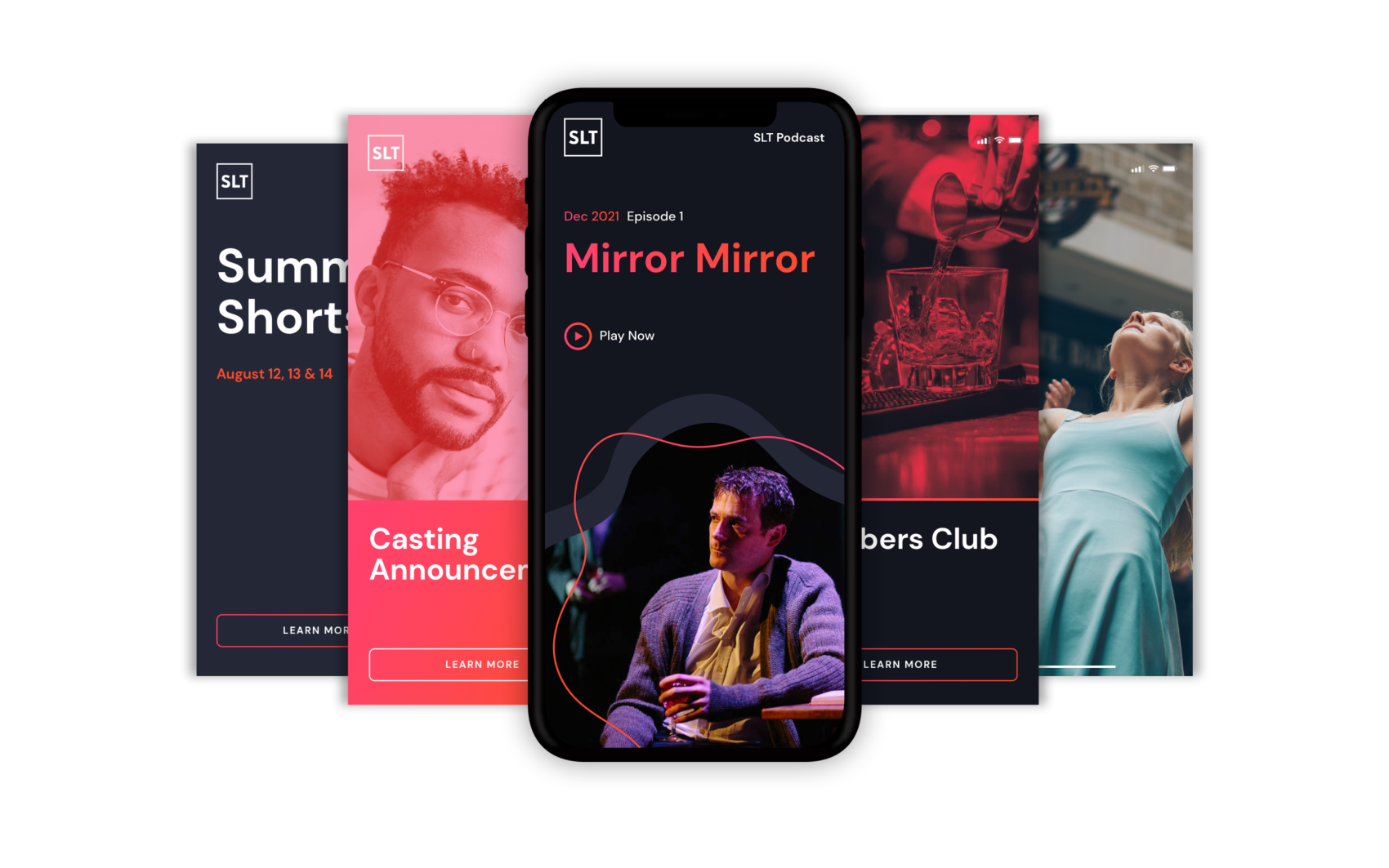
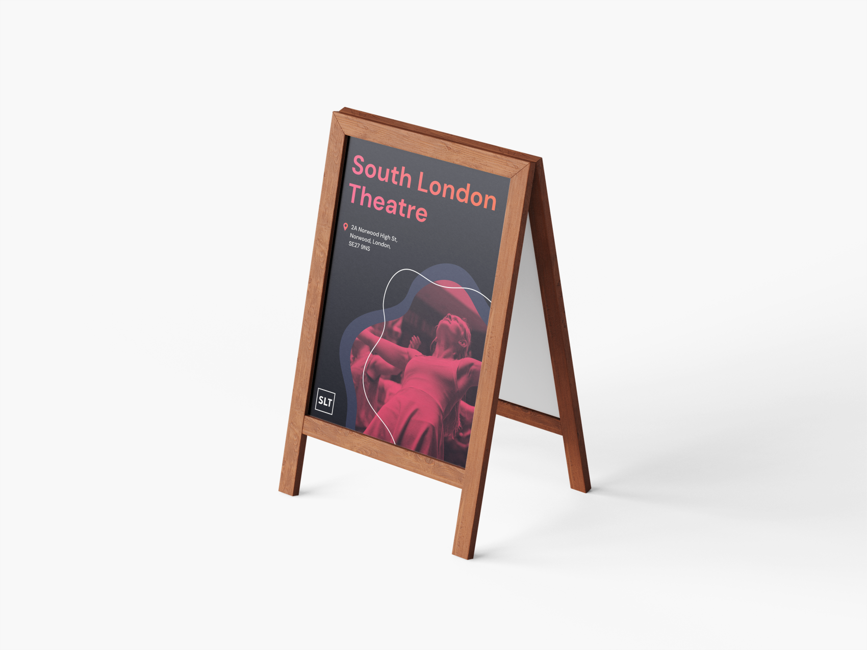
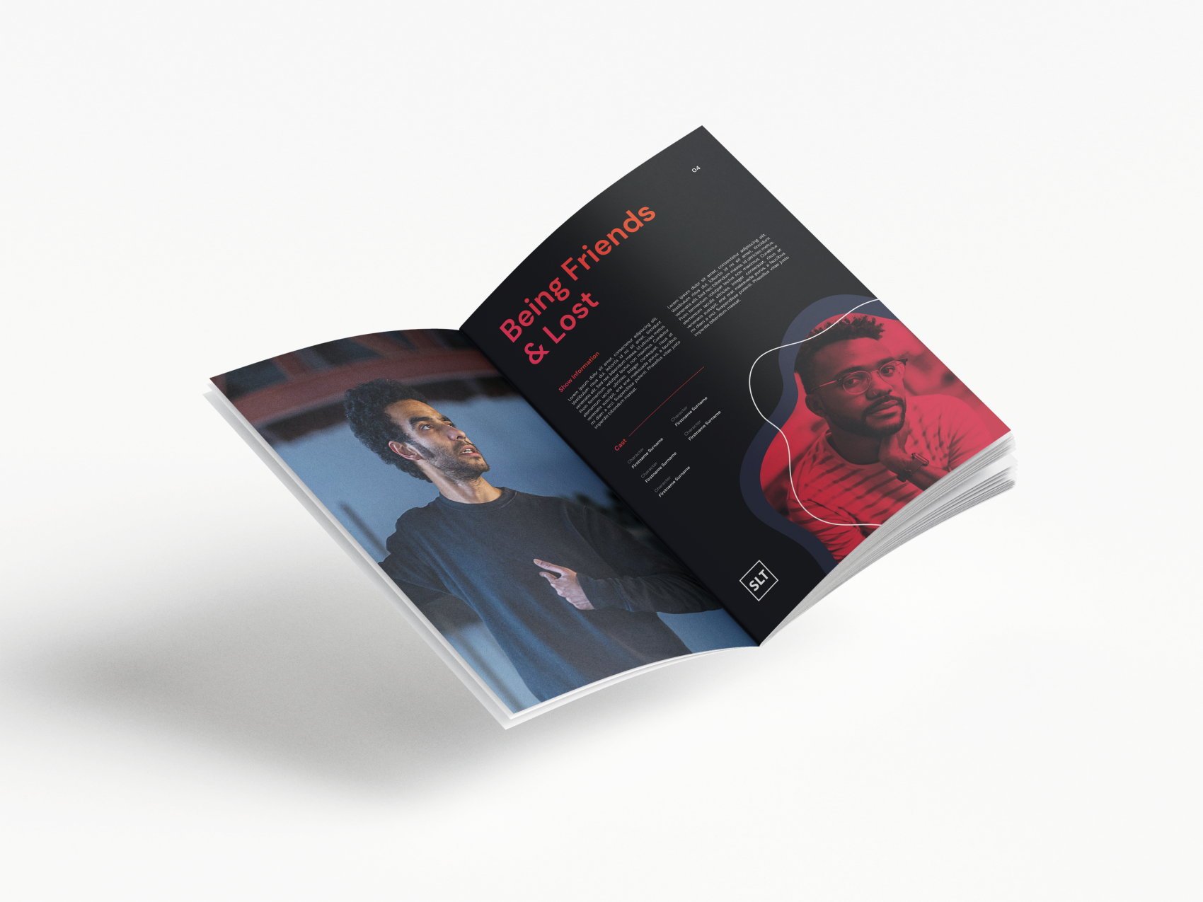
We love the effect that the improved digital brand we created for SLT had on the website. So much so, that we were keen to apply the new design system across a range of different print deliverables and other digital platforms.
We’re excited to explore further ideas and opportunities with SLT to see how these concepts can be expanded on and turned into physical assets for SLT to use. These ideas are conceptual and don’t necessarily represent real-world application at this stage.
Web development
We developed the website utilising repeatable page templates so the SLT team could benefit from a relatively unrestricted WordPress CMS and make use of the flexible grid approach to easily upload new content with varying layouts in the future.
We don’t cut corners and we care about producing quality code, so we invested more time in the build than originally planned to deliver a website and CMS that matched the high quality of the designs.
