Chaptr
Holding image

MediCinema


An Oscarworthy website to help improve the quality of life of NHS patients.

Services

Development

UX

Web Design

sectors

Film & Cinema

Non-profit

MediCinema was founded in 1999 and has given more 
than 300,000 experiences to patients, their families, carers and those closest to them.

Design mockups of different elements of the MediCinema website including the homepage and cinema listings.

"My adoration for Film is closely matched by another passion that is an integral part of this project – the NHS. Perhaps it is because my wife is a doctor, but the NHS holds a special place in my heart. I couldn’t help nodding and smiling whilst reading the brief, thinking, yes, this has to happen in more hospitals."

Joe Perkins, connecting with the cause
Chaptr Managing Director

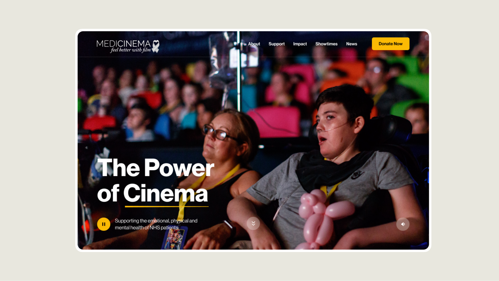
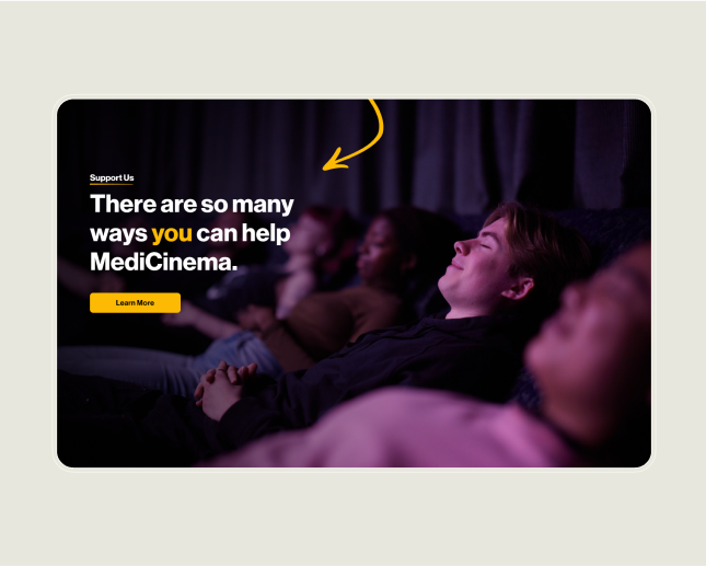
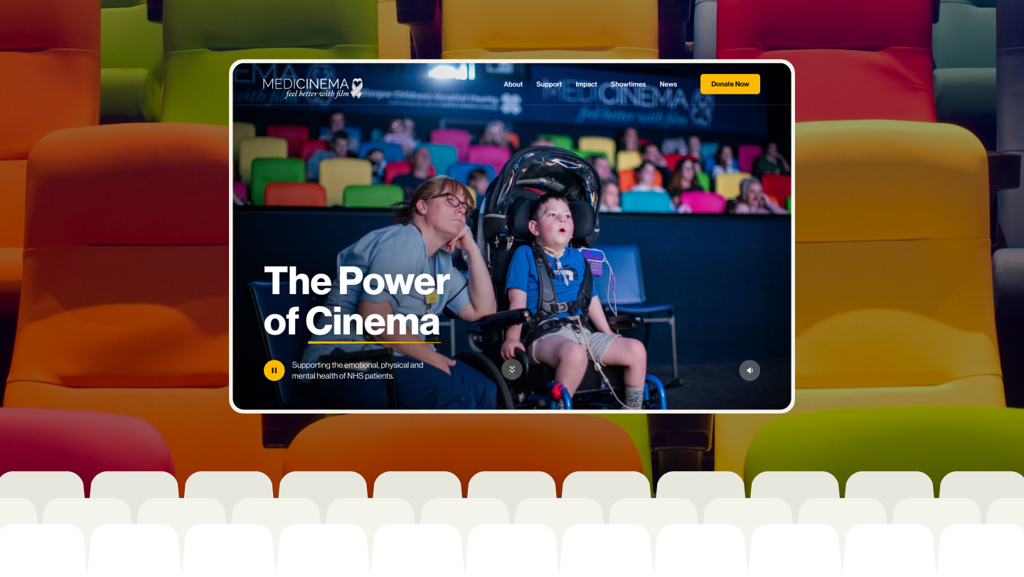
A design mockup of the MediCinema homepage showing two people sat watching a film at a hospital cinema.

Brief Overview

The primary goal of the new website was to help MediCinema increase revenue through donations and fundraising by engaging visitors who connect with its cause and wish to support its success. We achieved this by enhancing the user experience, improving visibility, seamlessly integrating with Donorfy, and creating an accessible design that inspires people to take action.

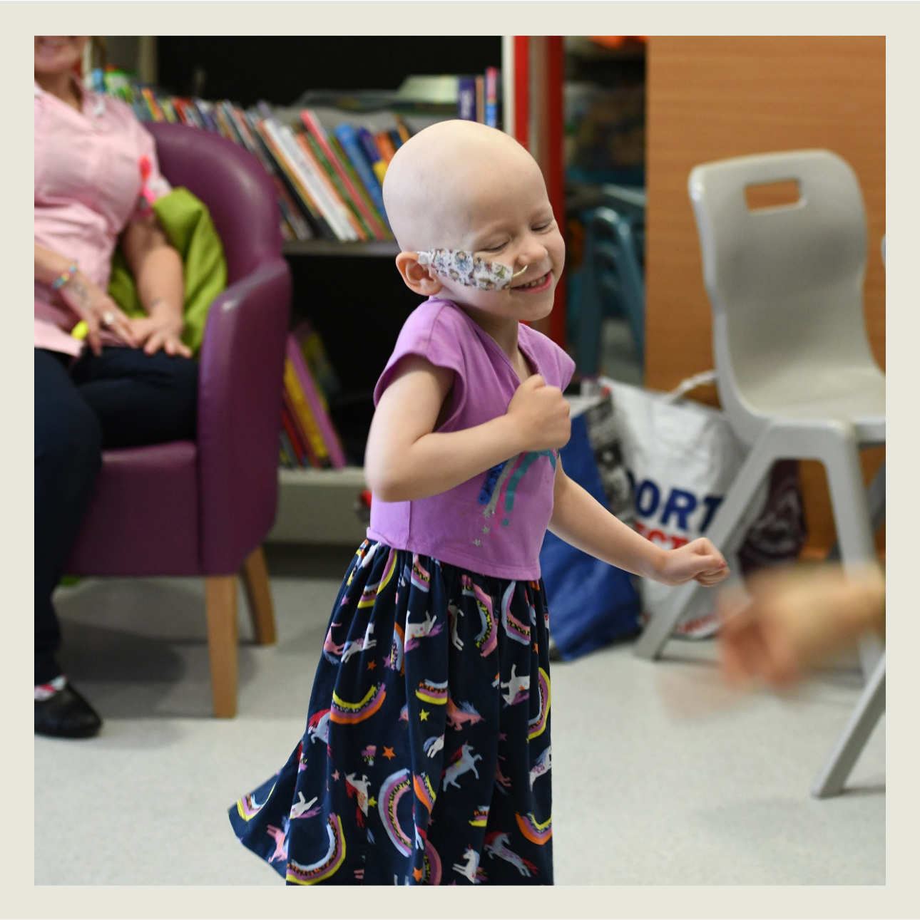
A child looking happy whilst receiving medical treatment.
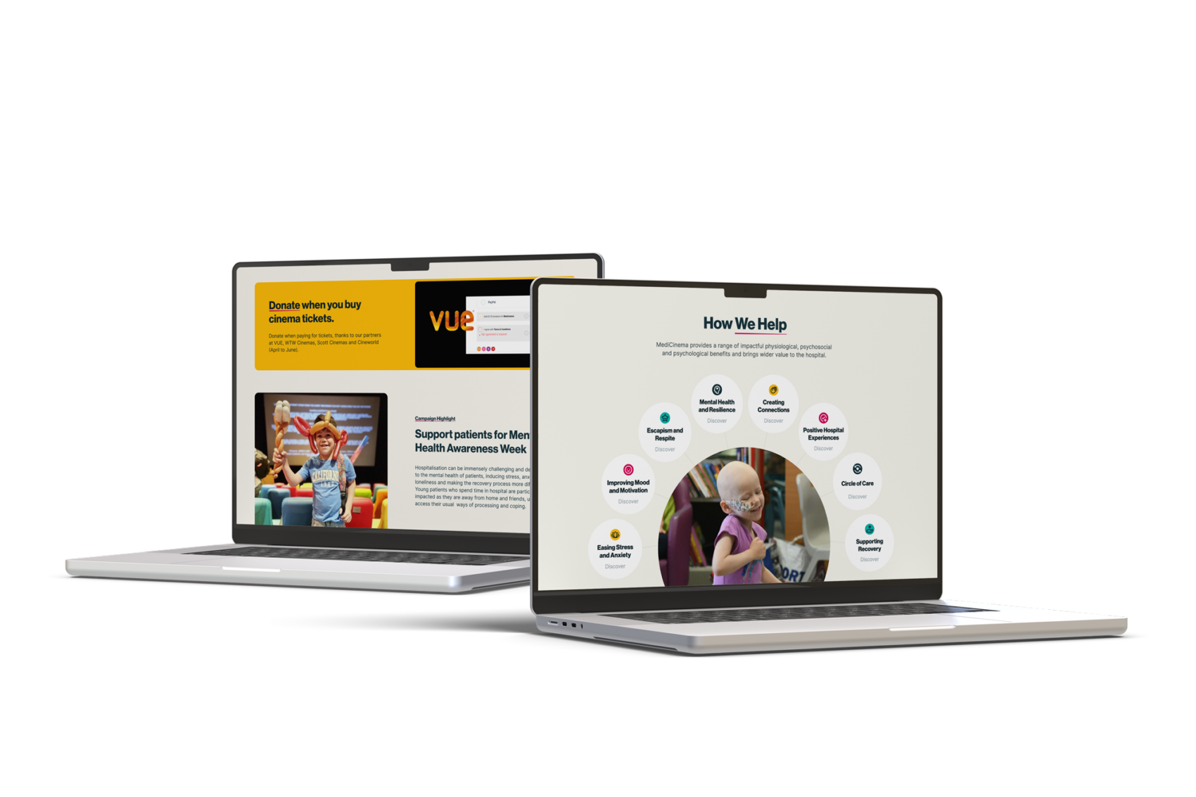
Two design mockups of the MediCinema website displayed on computer screens.

"We are looking for a fully refreshed website which reflects the personality and needs of the charity. We need people to feel the impact of our services – we’re not a ‘nice to have’, we make a real difference to patients."

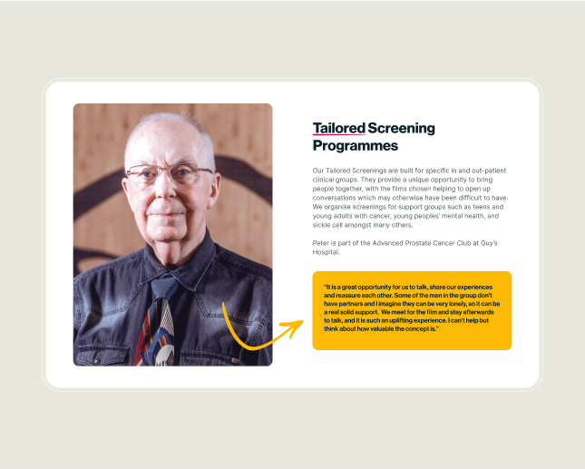
A screenshot of a MediCinema testimonial.
A design mockup of a screen showing different ways to support MediCinema

Understanding

We began the project by meeting with key stakeholders from both sides to ensure a clear understanding of the brief, address any knowledge gaps, and provide an opportunity for questions. This also allowed us to discuss each stage of the project to help manage expectations.

The User Journey

User experience was a key focus, so after auditing the existing site, our aim was to make it easy for people to donate and for patients to view current films, send showtime enquiries to their chosen hospital or site, and book seats. To achieve this, we reduced cognitive load by removing unnecessary links and pages, restructured the content hierarchy based on website goals, and designed an intuitive layout with clear user paths to increase conversions and avoid dead-ends.

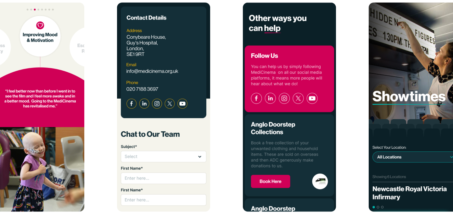
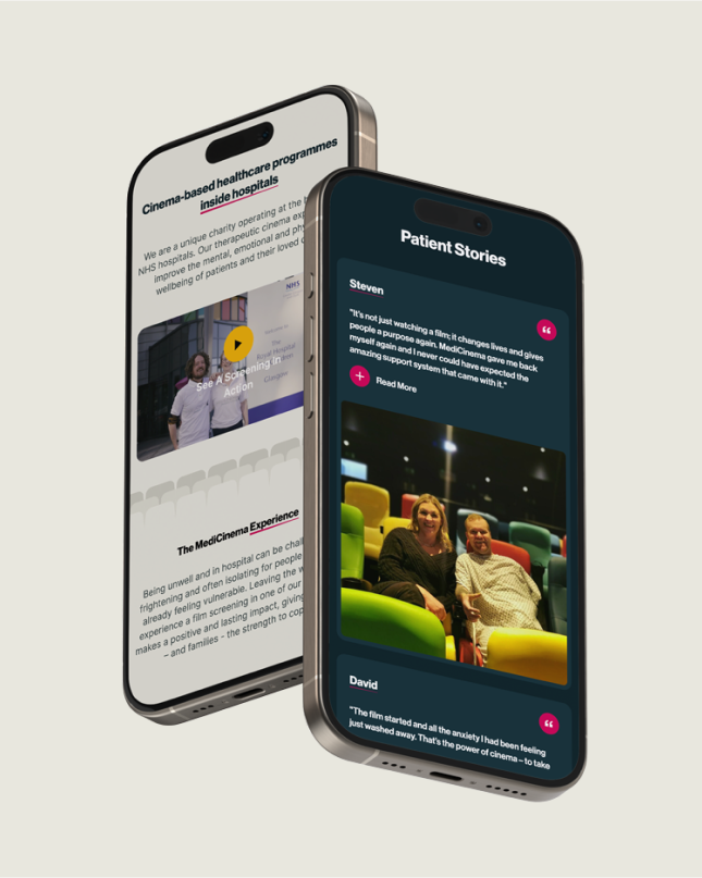
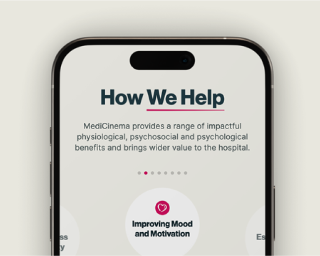
Design mockups showing how MediCinema displays on a mobile device.

A Broad Appeal

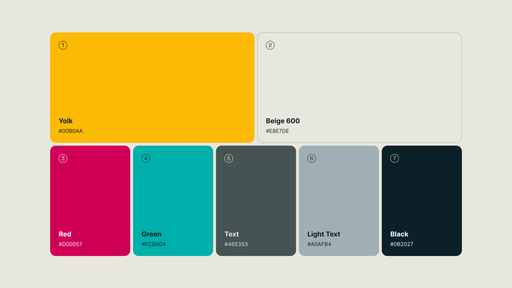
One of our early creative challenges was establishing a design system for the website. The seven brand colours, inspired by vibrant cinema seats, had previously felt overwhelming, childlike, and playful—qualities MediCinema felt were misaligned with their values. The new design needed to capture the magic and escapism of cinema while conveying professionalism and credibility to instil trust and competence. The final concept was met with enthusiasm, excitement, and minimal requests for revisions.

The MediCinema team wanted the design to reflect an immersive cinema experience. To achieve this, we created a parallax cinema seat animation that moves slower than the rest of the page as the user scrolls. This feature creates the illusion of depth, offering a first-person perspective of the onscreen content, as if the user were seated in a cinema, looking up at the screen.
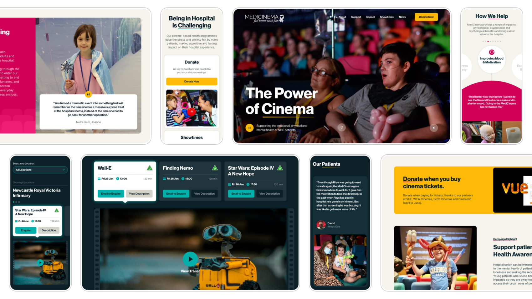
Mobile device design mockups.
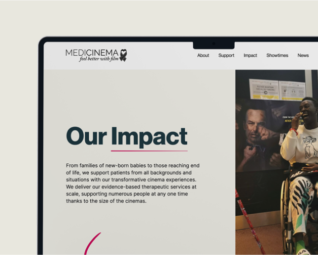
Design mockup of 'Our Impact Page'
Design mockup of How We Help page.

Dynamic by Design

We used WordPress to create a dynamic CMS that supports various content types and media, meeting a key requirement of the brief. The platform is intuitive, allowing the MediCinema team to easily manage and update content independently, without needing our assistance.

Digital Branding

During our design process, we developed digital brand elements that resonate with MediCinema’s audience, including a carefully curated colour palette, a distinctive typographic style, and a cohesive graphic language.

A design mockup illustrating the MediCinema brand colours.

"We’ve had such lovely feedback from the Cinema Managers, especially on the new site. Our longest-serving manager at 15 years, told us she loved it and that seeing the impact of the screenings they run on patients and families laid out like this 'moved me to tears'."

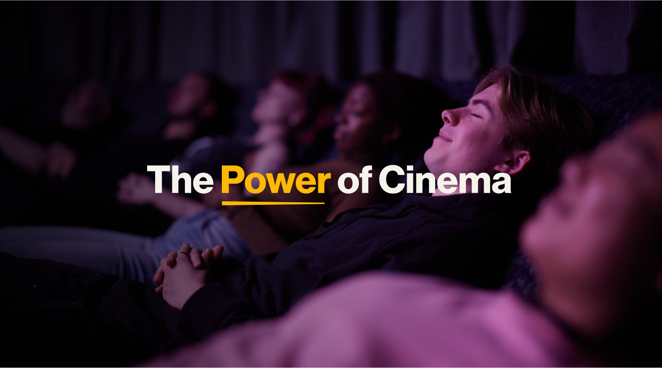
A design mockup with the text on saying 'The Power of Cinema'.

Web Design

We had a clear development approach from the outset, but with our experience, we understand the importance of flexibility. Following the project discovery phase and as the project evolved, we adapted our approach to better suit the bespoke nature of the design. This led us to adopt a more agile development process, allowing us to design and build pages dynamically while keeping the project on track. The trust built throughout the collaboration meant that MediCinema was open to extending the deadline to ensure quality, and they are thrilled with the result—a seamless, high-performing experience on both desktop and mobile.

Technical Integrations

Donorfy, a trusted CRM supporting thousands of non-profit organisations worldwide, is widely used by charities across all causes. Our challenge was to seamlessly integrate Donorfy with the new MediCinema website, making donating and managing donations an easy and streamlined process.

Our Technical Lead, Michal, enjoyed the challenge:

“Working with 3rd party integration is always interesting. Having a custom form design and integrating it with a payment provider was challenging but it was also a great learning experience!”

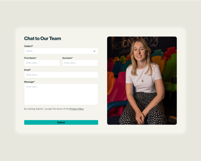
Dynamic contact form for MediCinema website
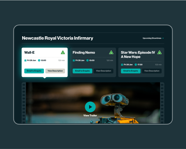
Showcasing the MediCinema film selection functionality

Dynamic Contact Form

A dynamic contact form that adapts based on the page the visitor is on, pre-populating relevant fields to make it easier and faster for users to get in touch about what they need specifically e.g. Showtime Enquiry, Fundraising or Volunteering. This feature streamlines communication by offering tailored options, ensuring inquiries are focused and efficient.

Enhanced Film Listings and Showtime Inquiries

An intuitive shows listing page with current film showtimes and a simple, step-by-step process for booking screenings, making it easy for patients to view films, send showtime inquiries, and reserve seats.

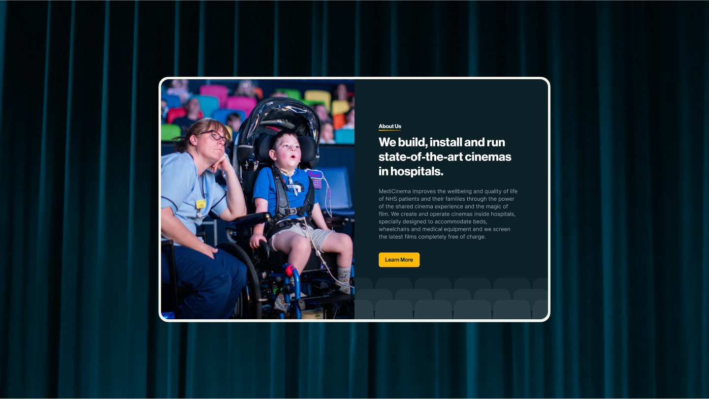
MediCinema website mock-up, with a background of cinema curtains.

"We are absolutely thrilled with the new MediCinema website, it looks glorious and fulfils all the hopes we had for it when we came to Chaptr last year. The beautiful and very thoughtful design displays who we are as a charity and how we want to be perceived, showing our impact and the services we deliver in a way that brings a depth of understanding we have not had before. We love it! As a team, we feel extremely proud to be able to send our prospective supporters and donors - as well as patients who have already started to use it - to our new website and are sure that anyone who visits can only take away a clear and positive perspective on the work we do inside the NHS. Chaptr were fantastic to work with; considerate, flexible and patient throughout and we'd happily recommend them."

Lysette Cohen
Director of Communications at MediCinema