I think we have a shared responsibility to ensure our website is accessible to individuals, businesses and societies.
Digital presents a huge opportunity for the arts and culture sector by allowing people to experience and connect with content in new ways, from their devices, in the comfort of their own homes.
It allows you to take the experience to people without them having to come to you.
And the reach of your content is likely to be many times greater than traditional footfall to your venue.
These new and exciting possibilities, however, bring about considerations and challenges around how we can continue to inspire everyone online including, but not limited to, those who are D/deaf, disabled or neurodivergent for example.
It’s reassuring to us that we see a need for an ‘accessible website’ occurring more and more in project briefs, quite often the phrase is used as a bit of a buzzword, shrouded in ambiguity.
The aim of this article is to provide more context around what it means to have an accessible website and why it’s important for your arts and culture organisation.
Steve Krug, Author of Don’t Make Me Think… (a book about usability in web design and development) says:
“The one argument for accessibility that doesn’t get made nearly often enough is how extraordinarily better it makes some people’s lives. How many opportunities do we have to dramatically improve people’s lives just by doing our job a little better?”
It’s also worth noting that if you’re a public sector organisation, your website needs to be accessible by law and you must include an accessibility statement.
In a report by Arts Council England, The Digital Culture Network breaks accessibility into 4 key principles, based on the Web Accessibility Initiative’s (WAI) guidelines;
- Perceivable – information and content presented in a way users can perceive it
- Operable – users can find and use your content regardless of how they choose to access it
- Understandable – users can understand your content and how the service works
- Robust – your content can be interpreted reliably by a wide range of user agents
Whilst the breadth of accessibility requirements varies from project to project – below, we have highlighted some best practice considerations and included further aspects to consider based on the aforementioned 4 principles, from the quick wins to the more complex.
Perceivable
Using alt text on all images
It is important to include alt text on all images and complex graphics to make content for users with disabilities more accessible. ‘Alt text’ is not only helpful for people with visual impairments, but it also supports the User Experience by giving users options to understand what the image, graphic or visual is representing.
Our helpful resource on understanding the importance of accessibility when using Alt Text on images is referenced in the Web Content Accessibility Guidelines 1.0 (mentioned in article number 6).
Provide captions for videos
Captions provide a text version of the conversation, this is obviously important for people who can’t hear so they can still understand the conversation. It’s also useful for people who prefer to consume video content without audio on.
Legibility (contrast, hierarchy and text layout)
It is a designer’s responsibility to ensure visual consistency. They should check the website is highly legible by reviewing the contrast, hierarchy and text layout. Designers can use contrast in many ways, for instance, colour contrast can be used to ensure text is legible thanks to a variety of colour blindness tests, this supports users with low contrast sensitivity. There are useful community plugins created in Figma such as Color Blind which tests 8 different types of colour vision deficiencies. Simply put, colour should be used to highlight content but not to communicate critical information.
It’s also important to create a sense of hierarchy throughout layouts to make it easier for users to determine the importance of content, this can be achieved through a mixture of graphical techniques such as text size and image size, to visually guide the user through content based on its priority. Wayfinding techniques can be used to support navigation through the use of breadcrumbs or arrows.

A person sketching in a notepad. Copyright Chaptr 2022.
Operable
Using invisible CAPTCHAs instead of one that relies on sight
The term reCAPTCHAs stands for “Completely Automated Public Turing Test to tell Computers and Humans Apart”, meaning that the security system makes it as easy as possible for users and difficult for bots to complete an action. Invisible reCAPTCHAs V2 has replaced the older usage where users were prompted to solve puzzles such as identifying objects.
The new invisible reCAPTCHAs V2 is a more accessible method for all users to access the website’s features through a simple click of a button. This makes it easier for people with disabilities such as dyslexia and visual impairments to interact with web content. You can read more about this here.
Make sure all interactive elements can be used with a keyboard
Users may not use a mouse when navigating a website, so keystrokes can be used to control functions and do not interfere with the browser or other open applications. Keyboard shortcuts should always be trapped in the desired component and should follow a logical order so everything still makes sense in the absence of using a mouse for navigation.
Avoid presenting text content as images
This is a simple one to follow, but it may require a little more development support to make sure your website is built with a flexible CMS so you can easily upload an image and type the text you want to overlay.
Make sure links are descriptive
Make it easy for users to understand what should happen when they click something like a button, image or link so they understand how it will help them to achieve their goals.
Understandable
Setting a lang attribute to set the page language
Multi-language accessibility allows for the targeting of specific countries so businesses can reach and engage a larger audience. This also helps Google promote specific web pages that match the language of the searcher.
Ensure the language option is clear and visible for the user to select. It is important to note that auto-generated language can be detrimental to the user’s experience and cause unnecessary confusion. Here is a great reference for how Google determines the best structure for website languages.
Keep things simple
Whilst it’s important to consider the context here, generally speaking, you should make sure your copy is clear and concise and avoid abbreviations and acronyms wherever possible. This also applies to the design, when you have a clear direction don’t overcomplicate things to support a predictable user experience.
Robust
Using responsive classes to adapt to viewport sizes
Websites are viewed through a wide range of display sizes from large scale such as TV screens for presentations to small sizes like mobile devices for browsing when we feel like it. So it is important to consider how each viewport is represented through layout attributes.
Working in breakpoints for layout adjustments allows designers and developers to produce a consistent website with accessibility considerations for elements such as image representation and text sizes. Here is a leading resource for best practices when thinking about viewports.
Further Considerations
Does each piece of content serve a purpose or support a key goal of the website?
Writing short simple sentences for websites is important for a time-sensitive audience. So try using direct sentences. Use white space and break up web copy to help your readers understand the purpose of your content.
You can do your own research on the readability of your website by using the tools below:
https://www.webfx.com/tools/read-able/
https://www.online-utility.org/english/readability_test_and_improve.jsp

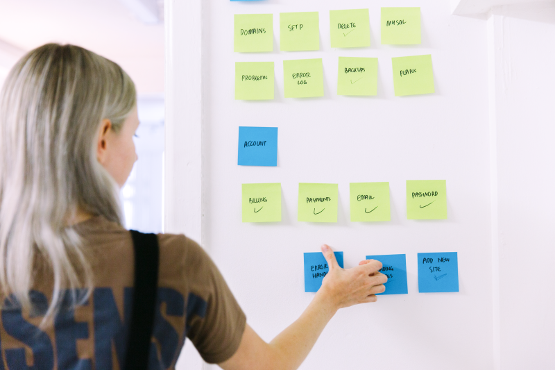
A person using sticky notes on a whiteboard. Copyright Chaptr 2022.
Images and graphics – do they serve a purpose or are they a distraction?
Images and graphics are a great way to give the user a break from reading and they can be used to create an engaging and interesting layout, but make sure they support your brand’s values and that any iconography is personalised and part of a dynamic design system that strengthens your brand identity. Don’t use visual aids just for the sake of it, they should provide more context and enhance the message, not dilute it.
Achieveing a balance in web design between competing content is challenging, but the aim is to ensure our audience can resonate with a brand and easily access the content they need or take the action they desire. A quote which resonates with our team is:
“I strive for two things in design: simplicity and clarity. Great design is born of those two things.” – Lindon Leader, graphic designer, Leader Creative.
Forms – are the forms relevant and easy to fill out?
Businesses use forms for a multitude of reasons, from collecting data for enquiries, registrations and customer feedback. Online forms need to be user-friendly and aesthetically pleasing. To achieve a form that our audiences can use with ease starts with considering the User Experience (UX) – this creates a clear hierarchy guiding the user through each step to completion. There are also additional steps we can undertake…
- Simplicity is key: do not add any unnecessary elements to the form
- Adding an order from simplest to hardest: ‘easing in’ the user to make the form digestible
- Validation fields: highlighting the mandatory sections with error messages if they have not been completed
- Adding clear headings and subheadings for form indication
- Using auto-filled browsers
- Including summary boxes that highlight potential concerns with users
- Creating a responsive and mobile-friendly form: ensuring our forms are working on a multitude of devices.
Not only will this make your website accessible to millions more people, but think of the increase in conversions if everyone can use your forms to submit data or make purchases.
Final thoughts
When approaching accessibility in web design and development it is important to evaluate throughout the process how the website can effectively help all types of people and not just the majority. The simple steps we have highlighted throughout this article set standards for best practice, and use the points to evaluate how your website will perform.
Below, we have included useful tools which can help you achieve your accessibility goals.
We think the ability to inspire people with content online is the future for arts and culture organisations, and we think we have a moral obligation to make that content as accessible as possible to help enrich the lives of everyone.
Hopefully, this article can help a few more people on their journey to digital accessibility.
Useful resources and tools:
Useful resources for understanding accessibility:
https://nda.ie/resources/accessibility-toolkit/make-your-websites-more-accessible/
How to Design an Accessible Website (A Complete Guide):
https://www.dreamhost.com/blog/make-your-website-accessible/
Web application for checking accessibility:
https://www.siteimprove.com/toolkit/accessibility-checker/
Understanding dyslexia in websites:
https://medium.com/branding101/designing-for-dyslexia-9e61945f82b0
How visual hierarchy can impact websites:
https://blog.hubspot.com/marketing/visual-hierarchy
Figma plugin, targeting contrast and accessibility in website design:
How can contrast better improve accessibility in website design:
P.S. Thank you to Joe Fielding, Senior Brand Designer at Chaptr, for the research and insight which led to this article.
P.P.S I know our website isn’t there yet, accessibility is a journey and we’re using this research as the basis for our new website (coming 2023).