So I caught up with the designers at Chaptr this week (Mitch and Connor) and asked them to reflect on the web design trends prevalent in 2017 and, more excitingly, what they predict we will see more of in 2018 – here’s what they said:
2017 – Looking Back
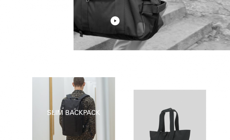
Asymmetrical Layouts
What stood in out in 2017 was the generous use of attention-grabbing asymmetrical layouts, and boy did we enjoy working with this technique; we applied it to C6 Life and enjoyed the planning it required to get the balance right with the image placement.
Scrolling Animations
We also saw a bolder approach to the use of scrolling animations. Designers and developers are thinking much more carefully about interaction design recently and it’s become a big part of the digital design process, for us at least. We really thought about this element of the user experience when relaunching our site last year. Check it out – Chaptr

2018 – Predictions
Mondrianism
Based upon Dutch painter Piet Mondrian’s mosaic designs, Mondrianism has been popular amongst the Dribbble community for some time. We expect that 2018 will see a more mainstream emergence of this style.

More Custom Illustrations
Custom illustrations became more prevalent towards the back end of 2017 and we expect to see this trend become increasingly popular throughout 2018, reaching whole new levels of creativity and originality.

Responsive Logos
For improved user experience and web browsing fluidity we expect to see more sites using a logo that shape-shifts to complement the screen size or responds to user interaction. This is a hot topic for the digital community at the moment. Read more about responsive logos here.
Split Screen
Split screens have always featured fairly prominently on the web, but it seems that designers and developers are getting braver with their application. Column based web layouts are finally beginning to interrupt the horizontal layout convention and we for one are glad of it.

Variable Fonts
Variable fonts is an interesting new topic for 2018 and we expect to see the use of them in full swing by the end of the year. Using variable fonts will change how we design for the web; giving us the flexibility to adjust a typeface’s width or weight depending on viewports and other variables, all the while reducing page load times. This will surely become a stalwart part of responsive design.
Layering
The increase of layers will become popular in 2018. The layering of type and other elements affords designers yet another way to differentiate layouts and explore new ways of presenting and connecting content. The stacking and converging of images, text, colour blocks and patterns helps create depth and, where appropriate, movement too.

Horizontal / Vertical (it doesn’t matter)
This will be a braver trend in 2018 but proceed with caution because, if done wrong, it could look like a complete car crash… But, done right, you could end up with a striking and unique design. Balancing a mixture of vertical and horizontal text will be difficult but we think you’ll see a lot more attempts in 2018 (for better or worse!).

Subtle Animations
Gone are the loud, in-your-face, animations – replaced with gentle and less distracting animations that provide a more enjoyable browsing experience. we think 2018 will see a considered use of animation to support the UX and we predict the gimmicky use of obvious animations, ‘just because’, will see a welcome decline.
