Over the past year we’ve seen a rise in the use of custom typefaces for brands, although custom typefaces are certainly nothing new – 2018 has seen a new wave that has gained some big attention in the creative world. Brands including the BBC, Google and Nokia have all cracked on with custom typefaces and in our opinion have succeeded! New to the world of custom typefaces was AirBnb, who released their typeface just a few days ago, created by the UK agency Dalton Maag.
So Why Do Brands Do It?
There are lots of reasons why brands produce custom typefaces, but the main reason is actually cost cutting. Creating a custom typeface can be an expensive and timely process, but paying a one time only fee for your typeface that can be used company wide beats paying for multiple license fees. With the number of hits these brands receive daily and the extent of media uses, the annual cost of licensing a font would prove extremely costly.
On the creative side of things, producing a custom typeface means a lot for the brands’ reputation. The originality of each individual character makes that typeface unique and is something that can be tailored to suit the brand. It creates a personality and reflects everything the brand stands for; its message, values and overall brand positioning. The creative freedom that comes with a custom typeface and the personality this can express is another obvious reason why it’s been favoured lately, as a human it’s natural to want to be distinctive, so if brands can do it then they should!
The great and the not-so-great Custom Typefaces
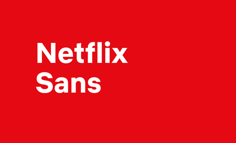
Netflix
Dalton Maag created a clean grotesque typeface for Netflix which is featured in several weights to serve both display and functional purposes. The uppercase has been described as ‘Cinematic’ and the lower case ‘Compact and Efficient’ by design lead Noah Nathan. You can read more about this over at It’s Nice That.
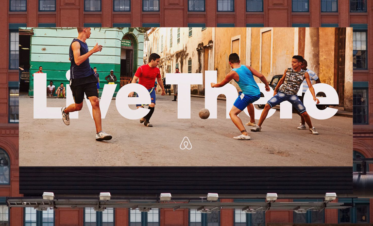
Airbnb
Airbnb released their new typeface earlier this month with Dalton Maag (You’ll notice a reoccurring theme here) – creating the bespoke font. Airbnb wanted a typeface that looked great both online and offline. We find the tidy typeface to suit the brand perfectly and we’re looking forward to seeing it in action.
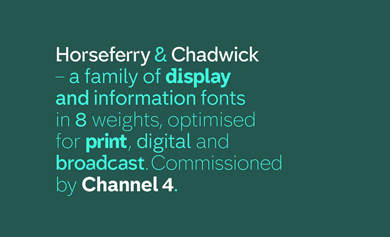
Channel 4
Channel 4 released their custom typeface a few years ago and it’s my pick of the bunch. The unique typeface brought a pleasing fresh spark to the world of TV; described as having ‘imbalanced flourishes and imperfections’. The offline and online media should be applauded as the angular typeface stands out amongst the others.
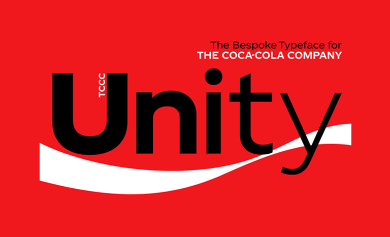
Coca-Cola
Possibly the least exciting pick of the bunch is Coca-Cola. Named ‘TCCC Unity’ the typeface is a simple creation that has so-called ‘geometric flair and circularity drawn from the archive form the basis of the Latin script’. We felt this went a bit unnoticed and was played a little safe.