Art Is Essential
The Contemporary Visual Arts Network (CVAN) represents and supports a diverse and vibrant visual arts ecology, embracing a broad range of artistic and curatorial practice across the nine English regions.
Art of every sort breaks barriers of race, religion, gender, class, economic disenfranchisement, communication and much, much more. Arts and culture are the bedrock of our civilisation.
A National Campaign
When CVAN reached out for support in a particularly uncertain time when the arts sector was facing turmoil amid a global pandemic, we were proud to answer their call and create the visual driving force behind CVAN’s plight to declare to the country that #ArtIsEssential (AIE).
United as one voice for the visual arts, we came together to be visible, to be heard.
A Bold Message
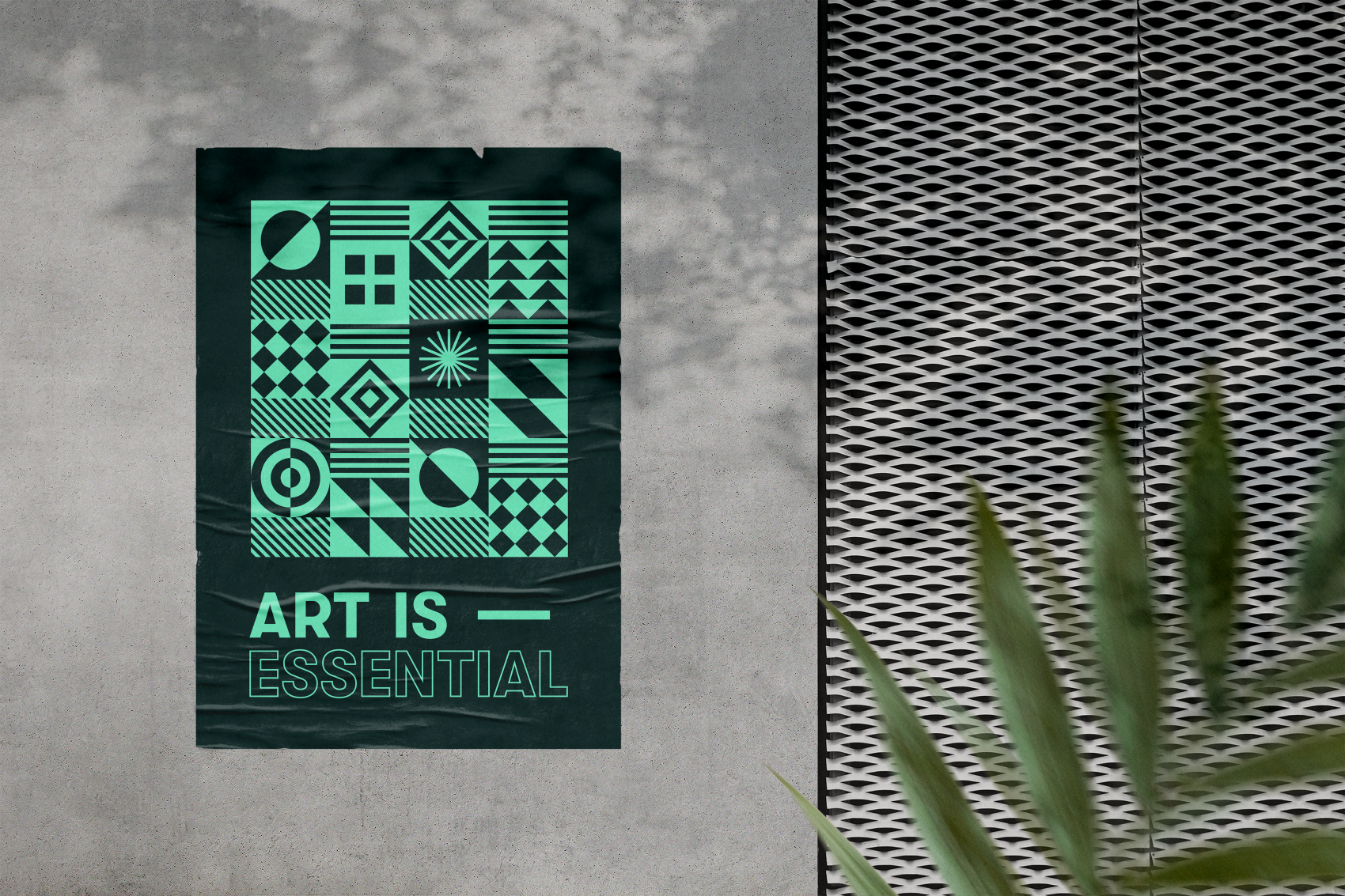
AIE represents a very meaningful and powerful message at a time of great difficulty for the industry, so we decided against the more common forms of typography in this sector (abstract or hand-drawn) and opted for a clean, bold and impactful typeface – a statement in itself which helped to communicate the strong and important narrative.
The Right Balance
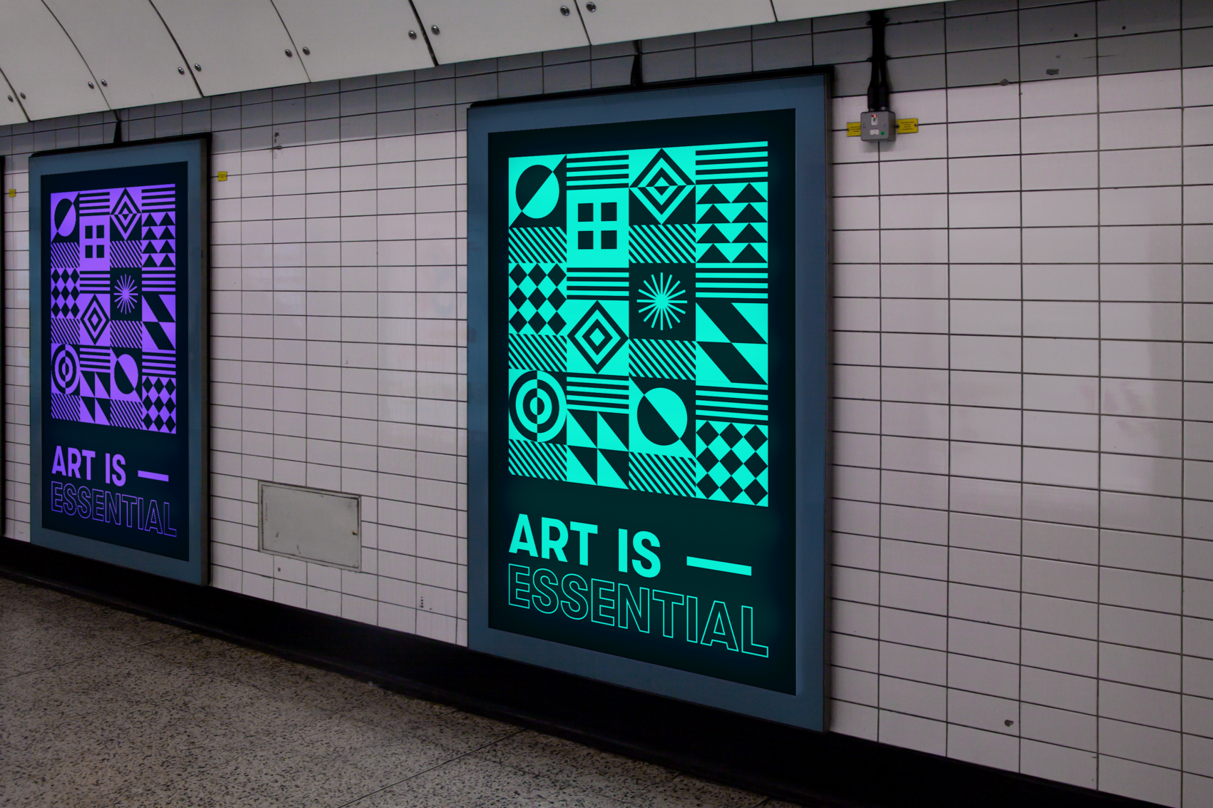
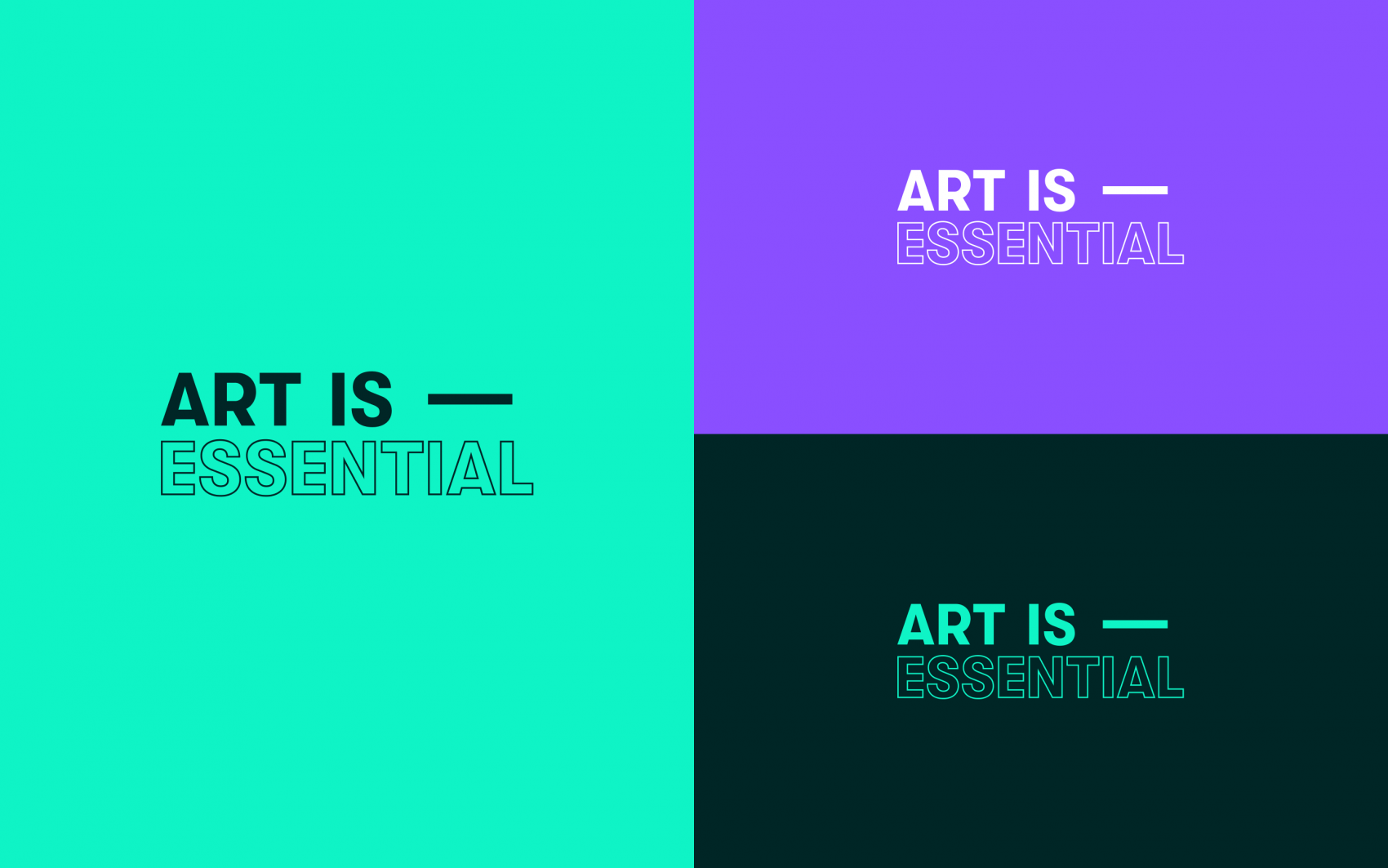
Looking closer, the bold sans type has enhanced legibility and stands out in a striking way when applied over imagery or against the brand pattern graphic to help make the message heard. The logo is essentially divided into two parts with the words ‘Art’ and ‘Essential’ the key components; both words are intentionally distinguished and balanced.
Intentionally Versatile
The sizing and weight of the text are identical with the word ‘Essential’ outlined and without fill so when the logo is overlaid on a background, colour or image, the background is visible, accenting the word ‘Essential’ without distracting the prominence of art. Plus, this looks really cool over imagery as a more general graphic device!
A Diverse Representation
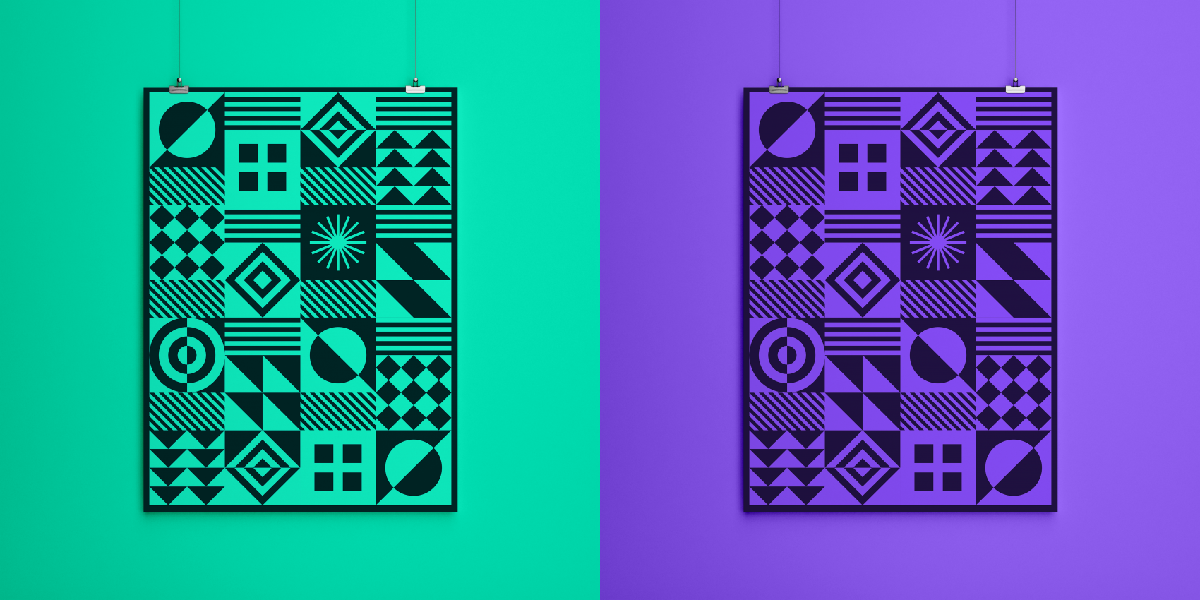
A key objective for the brand was to creatively represent a diverse form of art through a single unified message. So we created a counterchange style pattern to be applied as a graphic device across different mediums. Resisting the urge to give the pattern any literal connection to art, we wanted to symbolise creativity more broadly and convey the sense of ‘controlled-chaos’ true to the creative processes.
Expansive and Flexible
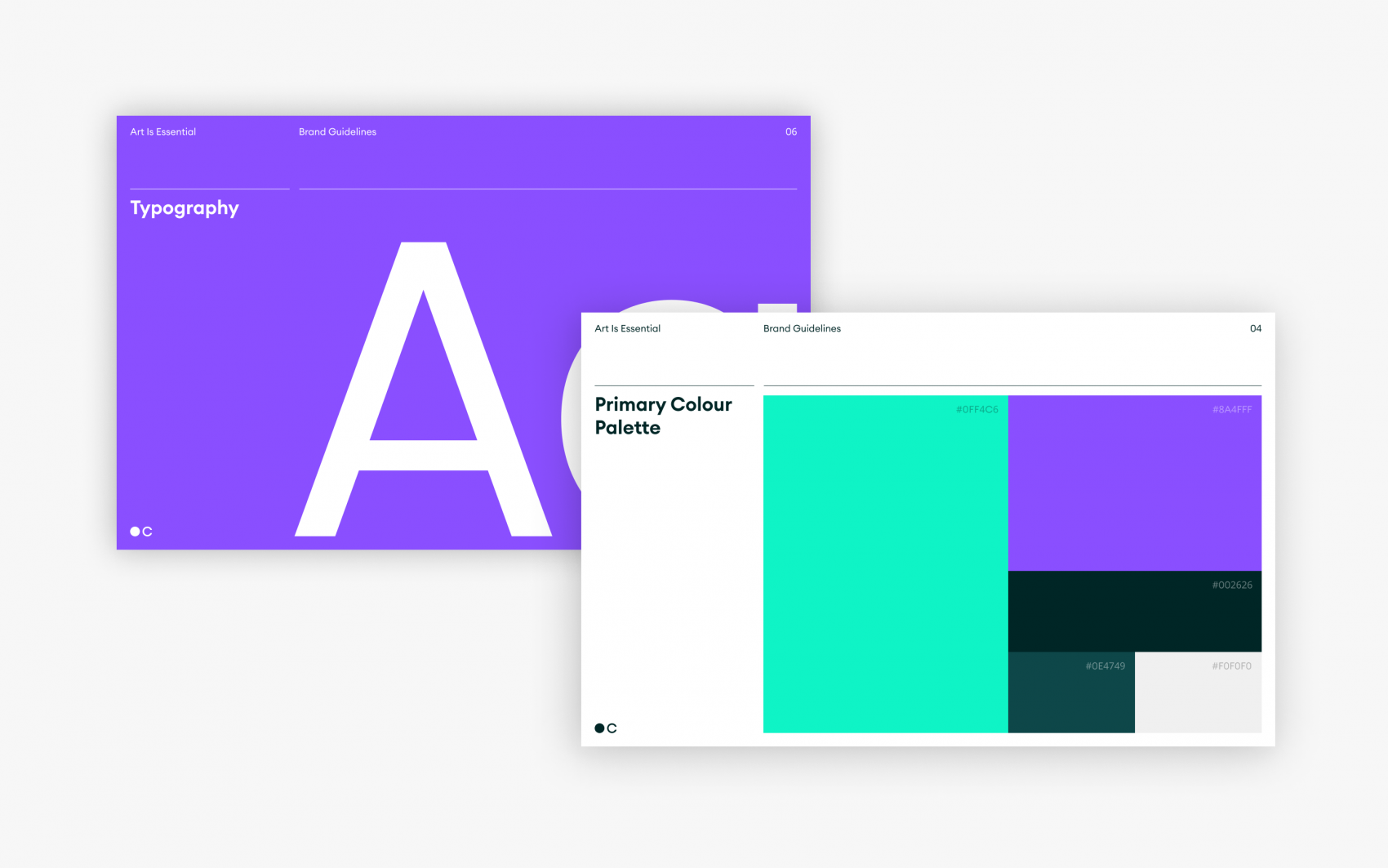
When you pair the above with a striking and vibrant colour palette, featuring a wide range of secondary colours, the result is a concept that provides flexibility to represent the diversity of the arts sector and can be applied to different mediums – as illustrated in this case study.
Please Note
For the purpose of this case study, we have included iterations of the logo produced throughout the process as well as the final choice by CVAN. We have also demonstrated the concept’s potential to be used across different mediums, but these are fictitious and don’t represent examples used in the real world.
“This was an ambitious campaign, working at pace, and I am aware that this couldn’t have happened without the dedication, understanding, and talents of Chaptr. The campaign made a loud noise, people listened and it became a real movement within the visual art sector, which still continues to have an impact today. We are really pleased to have partnered with Chaptr and would recommend them for work on any branding campaign within arts and culture.”
Katie Lineker – CVAN Marketing Consultant