Chaptr
Holding image

Projects Lyric Stage Boston

Digital Presence 

Meets Ambition for 

Lyric Stage Boston

View Live Site
Services

Development

UX

Web Design

sectors

Arts & Culture

Theatre

As Lyric Stage Boston entered a new chapter of leadership, attention turned to how its digital presence reflected the theatre’s quality and ambition.

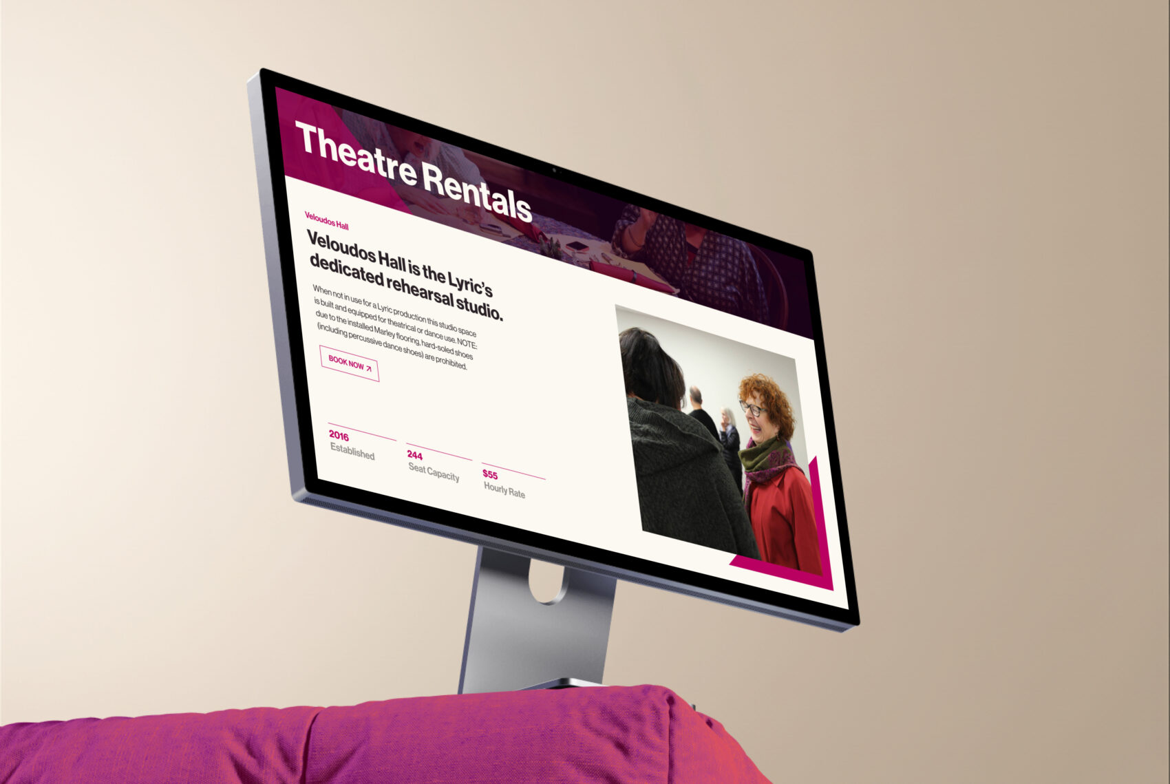
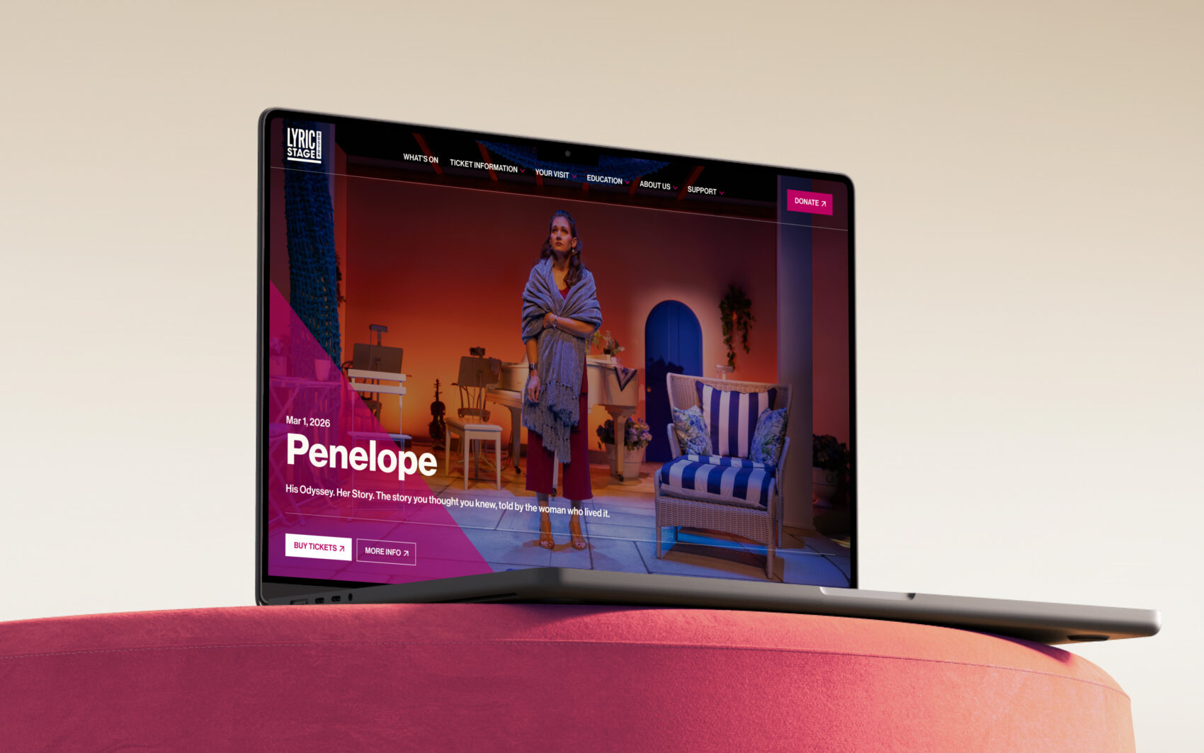
The existing website had served the organisation well, but it no longer fully captured the scale and confidence of one of Boston’s oldest theatres.

Internally, managing content required unnecessary work.

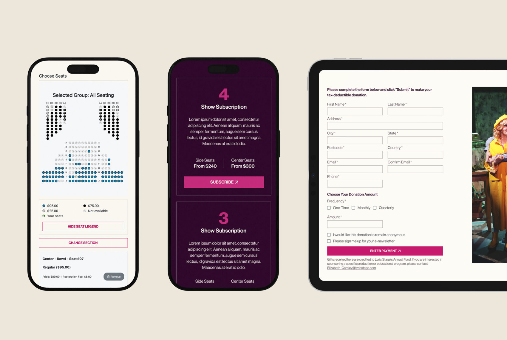
Externally, audiences encountered friction in the journey from production pages to ticket purchase.

The opportunity wasn’t simply aesthetic. It was about reinforcing confidence – in how Lyric Stage presents itself, and how audiences experience it.

The Challenge

Lyric Stage faced a widening gap between who they were as an organisation and how they appeared online.

An outdated platform and unclear user journeys made it harder to:

•   Discover productions
•   Understand the wider offer
•   Move smoothly toward booking

The most critical break occurred at purchase.

Audiences were routed into PatronManager, where the experience felt disconnected from the main site – visually and functionally. At the exact moment trust mattered most, continuity was lost.

Behind the scenes, the structure was equally limiting.

Rigid layouts and image-heavy pages reduced search visibility, restricted flexibility, and made updates harder than they needed to be.

The website wasn’t supporting growth. It was constraining it.

Four promotional tiles for a theater website featuring photos with a magenta overlay. The tiles are labeled “Subscriptions,” showing two actors in conversation; “Memberships,” showing two people sitting on steps; “Groups,” showing two women smiling and embracing; and “Pricing: Lyric For All,” showing performers in costume during a lively stage scene. Each tile includes a short description and a small arrow icon in the corner.
Angled smartphone mockup on a pink background displaying a theater website’s “Support Us” page. The screen features a banner image of a performer and the headline “Your Support Makes All the Difference” with a “Donate Here” button. Below, an education section titled “Helping Students Develop Their Artistic Skills” includes descriptive text and a “Learn More” button.

Stakeholder alignment and strategy

Before design began, we focused on building shared understanding across stakeholders.

Success wasn’t defined by aesthetics alone, but by clarity of purpose, who the site serves, how it supports teams, and how performance would be measured.

Close collaboration surfaced priorities, strengthened engagement, and clarified content ownership; insights that also informed refinements to Chaptr’s process.

Designing and delivering for clarity

With a clear strategic foundation in place, the focus shifted to translating that alignment into a practical, audience-centred digital experience.

Design and development decisions were guided by the need for clarity, flexibility, and performance, ensuring the site could support both day-to-day operations and longer-term growth.

This meant creating a content-led structure, flexible layouts, and reusable components that work across devices, improve search visibility, and give internal teams confidence to manage and evolve the site over time.

Computer monitor displaying a webpage for the musical “Penelope,” featuring show details, star rating, ticket purchase button, and summary, set above a pink couch.
Hands holding smartphone showing Lyric Stage Boston show details and booking times on a mobile screen.

From fragmented journeys to confident pathways

Previously, Lyric Stage’s website and PatronManager operated as overlapping but disconnected experiences. One of the clearest points of friction appeared around the What’s On journey. Audiences were taken from the main site to an event page, then routed back through an unbranded PatronManager listings page before finally reaching seat selection.

This duplication created unnecessary steps, broke visual continuity, and increased cognitive load at a critical moment in the journey.
By removing the redundant PatronManager “What’s On” layer and redesigning the flow end-to-end, audiences now move directly from an event page on the main site into PatronManager seat selection. This streamlined pathway reduces friction, preserves brand confidence, and helps users move from discovery to booking with far greater clarity.

Responsive previews of the Lyric Stage Boston website on mobile and tablet showing seat selection, subscription options, and a donation form.

Designing for PatronManager, not around it.

For Lyric Stage, ticketing is central to both audience experience and revenue.

Like many US theatres, they rely on PatronManager. The transition into purchase is therefore a critical moment of trust.

Rather than treating PatronManager as a separate system, we designed it with the ticketing journey in mind from the outset. The goal was clarity and continuity, ensuring the handoff into checkout felt intentional, not abrupt.

While the platform itself remained unchanged, careful configuration and styling brought the ticketing experience much closer to the main site – reinforcing confidence at the point of purchase, within platform constraints.

Desktop screen showing the Lyric Stage Boston website’s theatre rentals page with text about Veloudos Hall and a photo of people in conversation.

Visual evolution, not rebrand

This wasn’t a full rebrand. It was a confident digital evolution.

Core brand elements were retained and extended through:

•   A richer colour palette
•   A complementary typeface
•   Consistent image treatments
•   A triangular-frame graphic device

These refinements created stronger digital recognition while maintaining legibility and continuity with offline materials.

All elements were structured within a flexible design system, enabling reusable modules, faster content creation, and long-term consistency as the theatre grows.

The result: clearer hierarchy, reduced visual noise, and programming that feels intentional and welcoming.

Color palette swatches showing primary brand colors for Lyric Stage Boston website design.
Typography examples displaying the chosen fonts and type hierarchy used in the Lyric Stage Boston website design.

"From start to finish, the team at Chaptr performed at the highest standards of creativity, communication, and collaboration. They met our requests with a willingness to make the impossible happen and even exceeded our expectations in making our new website more visually engaging, easy to navigate, and representative of our brand and mission. Bravo Chaptr! "

Heather Darrow
Lyric Stage Boston