We’ve selected our 3 favourite rebrands from 2017, the year saw some notable rebrands including the storage powerhouse, Dropbox and recently F1, which saw its iconic logo get upgraded to something a bit more modern. But away from these global rebrands we thought we’d show you something that might have slipped under the radar – we hope you will enjoy discovering them as much as we did.
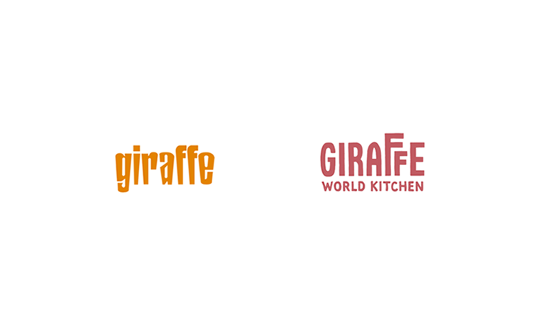
Giraffe
The food industry is a fast-paced non-stop revolution of new trends. Restaurants are trying to keep up with the general public’s ever changing likes and dislikes; keeping your brand on-trend is becoming more and more essential.
We believe Giraffe’s latest rebrand hits all the right spots and puts the brand in a great place, the new warm colour palette encapsulates the brand’s welcoming theme and the combination of colours on display works well across the multitude of media, including the interior of the restaurants. The custom brush type helps bring the new ‘World Kitchen’ idea to life and conveys the organic, earthy feel that runs with the chosen colour palette. Finally, we come to the much needed updated logo; gone is the sharp-edged, harsh orange logo and in replacement we have a new fun, homely rounded type. The use of the first extended ‘F’ is a nod to the height of its animal namesake. Overall the rebrand for us has provided exactly what the restaurant needed (if there was a restaurant closer to the studio – I think they would make a bit of money from us!).
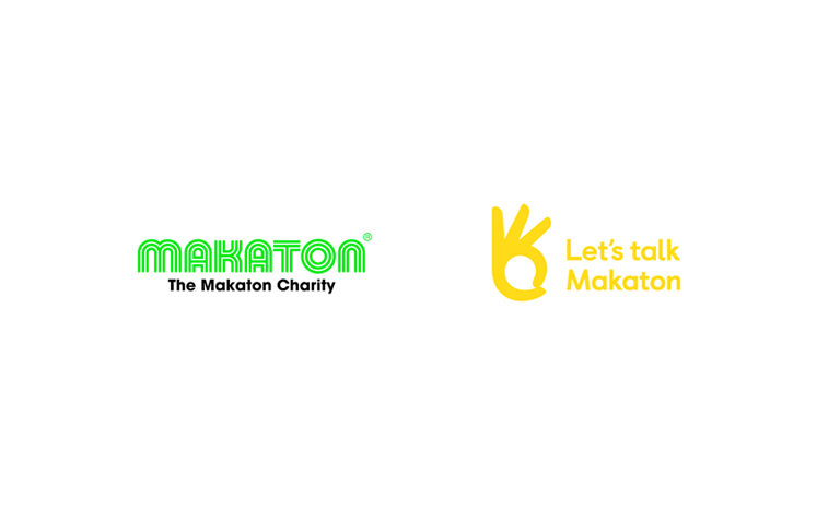
Makaton
Another rebrand that Chaptr was impressed with is Makaton. The charity specialises in language systems for people with learning and speaking difficulties and they have perused a new identity. Moving away from a 1970’s football-esque logo, the charity has gone all out to show off the brand’s identity and to establish themselves as a sign language system, something that the previous logo didn’t accomplish.
The bright colours and large icon grab your attention from the word go and it’s something that can’t be ignored throughout the whole identity. The loud colours help convey the brand’s message and develop a new, fun personality. The well-executed icon partners perfectly with the clean sans-serif font; its clever design helps showcase the service offering and the genius speech bubble inside the hand helps the audience understand that Makaton also help people with speech difficulties. Throughout the rebrand, the playful vibe is carried through to other medias and merchandise including the pairing with some neat line illustrations. Finally, the brave move to remove the ‘Charity’ from the old logo, pays off and helps the brand become much more than just another charity.
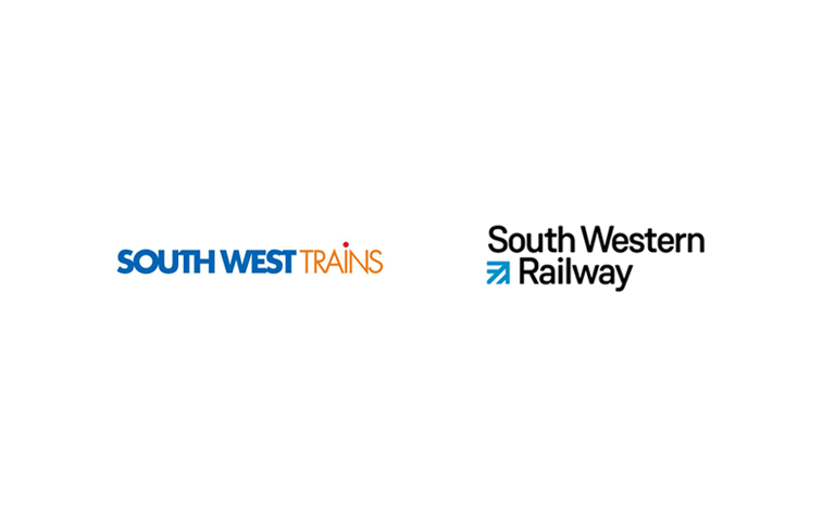
South Western Railway
Our local train service got a great little upgrade this year and with a change of name South Western Railway went in a completely different direction. Gone is the bright, full caps logo replaced with a simple, modern upgrade that oozes a professional charm.
The new logo finally now looks like a transport service, something that the previous brand failed to achieve. The icon could be interpreted as train tracks with the peak of the arrow being characterised as London Waterloo; the rest of lines show the South West location in which the trains travel from – very clever! Its passive colours provide the service with a distinctive business class vibe and helps give the service a much-needed boost. Overall South Western Railway played the rebrand safe, sometimes there isn’t a need to go over the top and honestly, its made our journeys to London that tiny bit more enjoyable.